|
|
The Lexis Diagram |
|
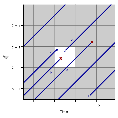 |
The above Figure depicts a Lexis diagram, which is a plot of a population's life experience in time vs. age. The graph is sectioned into 1-year by 1-year cells. Each 45¯ line represents an individual's life, which ends in death (red 'x') or out-migration (solid dot). An individual also may, at some time, migrate into the population (hollow dot).
Demographers often estimate a death rate for each 1æ1 cell. Consider the 1æ1 cell highlighted
in the above figure, which starts at time t and age x. If the exact life lines
are known, then exposure in person-years can be calculated by adding up the length of each of the
observed life lines that lie in the cell (of course, the total is divided by
 , since the life lines are 45¯ to the
time axis). The estimate for the death rate for this cell would be the number of deaths (in
this case, one) divided by the person-years of exposure.
, since the life lines are 45¯ to the
time axis). The estimate for the death rate for this cell would be the number of deaths (in
this case, one) divided by the person-years of exposure.
However, exact life lines are rarely known. Instead, what are often known are the counts of individuals alive for each age at exact times t, t Ý 1, t Ý 2, etc. In the case of the highlighted cell above, for example, the count at time t and age x is 2 (lines b and c) and the count at time t + 1 and age x is 1 (line a). The population estimate for the cell is obtained by taking the average of the two counts. (Incidentally, line d does not contribute to this cell's exposure estimate as it does not cross either of the boundaries at times t and t + 1.) The estimate of the death rate in this example, then, is:
1 death ¼ 1.5 person-years = 0.67 deaths per person-year of exposure.
For comparison, a rough estimate of the death rate based on eye-balling the exact lengths of the life lines in the highlighted cell is 0.95 deaths per person-year of exposure.
Maintained by: Pierre Vachon